Hey, look down at your hand! Chances are, you’re clutching a phone. It’s true, mobile devices have become an integral part of our daily lives. Tik Tok, mobile gaming, streaming services, map wayfinding… That palm-sized rectangle can do so much, and we’ve all formed a reliance on it.
With more people accessing the internet on their smartphones and tablets, it’s essential for businesses to ensure their websites are optimised for mobile viewing. Mobile-first design is a design approach that prioritises the user experience on mobile devices, ensuring that websites are accessible, usable, and engaging across all screen sizes.
The Rise of Mobile Usage
The proliferation of smartphones and tablets has led to a significant increase in mobile internet usage. According to Statista, smartphone users in Malaysia were estimated to number 29 million in 2021, and is projected to grow by another 1.74 million by 2025. This trend has made it imperative for businesses to adopt a mobile-first approach to their website design.
The Benefits of Mobile-First Design
- Improved User Experience: Mobile-first design ensures that your website is easy to navigate and use on smaller screens. By prioritising mobile users, you can provide a better overall user experience and increase customer satisfaction.
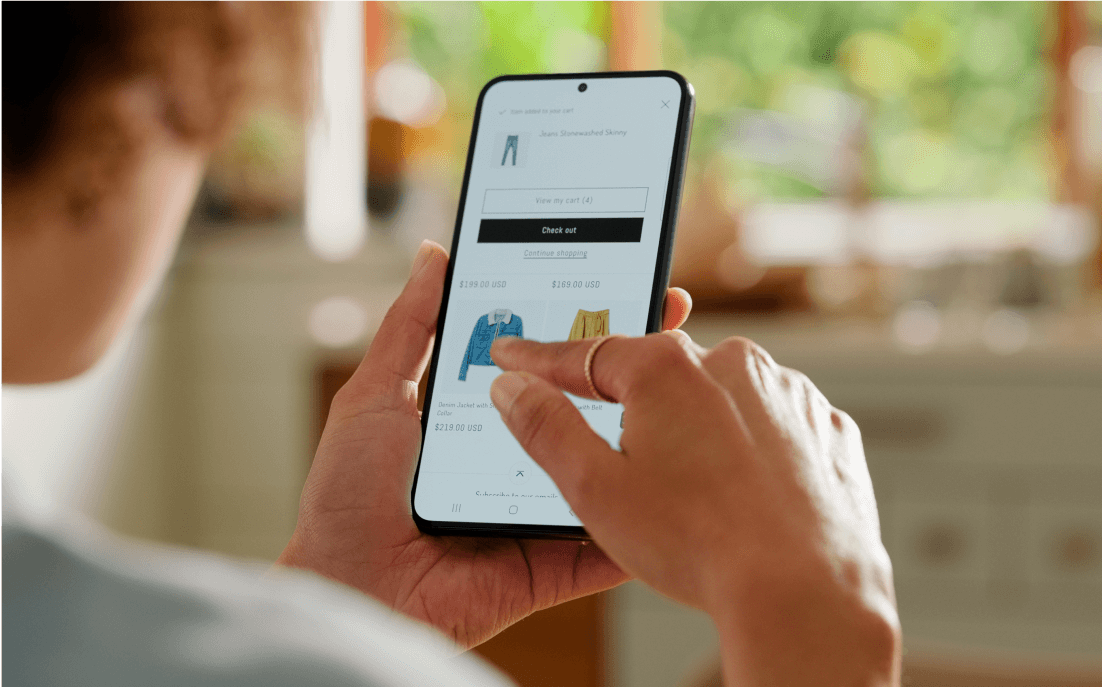
- Higher Conversion Rates: If you are getting started on your ecommerce development, it’ll be vital to know that mobile-friendly websites have been shown to have higher conversion rates. When visitors can easily find what they’re looking for and complete their desired actions on a mobile device, they are more likely to make a purchase or sign up for your services.
- Better Search Engine Rankings: Google and other search engines now prioritise mobile-friendly websites in their search results. By designing your website with mobile users in mind, you can improve your search engine rankings and attract more organic traffic.
- Enhanced Accessibility: Mobile-first design can make your website more accessible to people with disabilities.By ensuring that your website is easy to navigate and use on smaller screens, you can improve accessibility for all users.
- Cost-Effective Development: Designing for mobile first can actually be more cost-effective than designing for desktop first. By focusing on the core elements of your website and ensuring that it works well on mobile devices, you can avoid unnecessary complexity and reduce development costs.
Key Considerations for Mobile-First Design
- Responsive Design: Ensure your website adapts seamlessly to different screen sizes using responsive design techniques. This involves using flexible layouts, fluid images, and CSS media queries.
- Simplified Navigation: Keep your navigation menu simple and easy to understand on mobile devices. Consider using a hamburger menu or a sticky navigation bar to optimise space.
- Optimised Images: Compress images to reduce load times and improve performance on mobile devices.Consider using lazy loading to defer the loading of images until they are needed.
- Touch-Friendly Elements: Ensure that all clickable elements, such as buttons and links, are large enough to be easily tapped with a finger. Avoid small, hard-to-hit elements.
- Fast Load Times: Mobile users have shorter attention spans, so it’s essential to ensure your website loads quickly. Optimise your code, images, and server settings to improve performance.
In today’s mobile-centric world, mobile-first design is no longer an option but a necessity. By prioritising the user experience on mobile devices, you can improve your website’s performance, attract more customers, and enhance your brand reputation.
Time to Get Mobile and Call Us!
When it comes to making sure your website shines for mobile users, our experienced team of designers and developers has got what it takes.
If you’re looking for tailored creative solutions, Asteria Creatives is an integrated creative agency that offers 360-degree services designed to meet your unique goals. From websites to branding in Malaysia, digital copywriting, ecommerce development and logo design for the company, we’re here to help. Contact us for a consultation.